Introduction
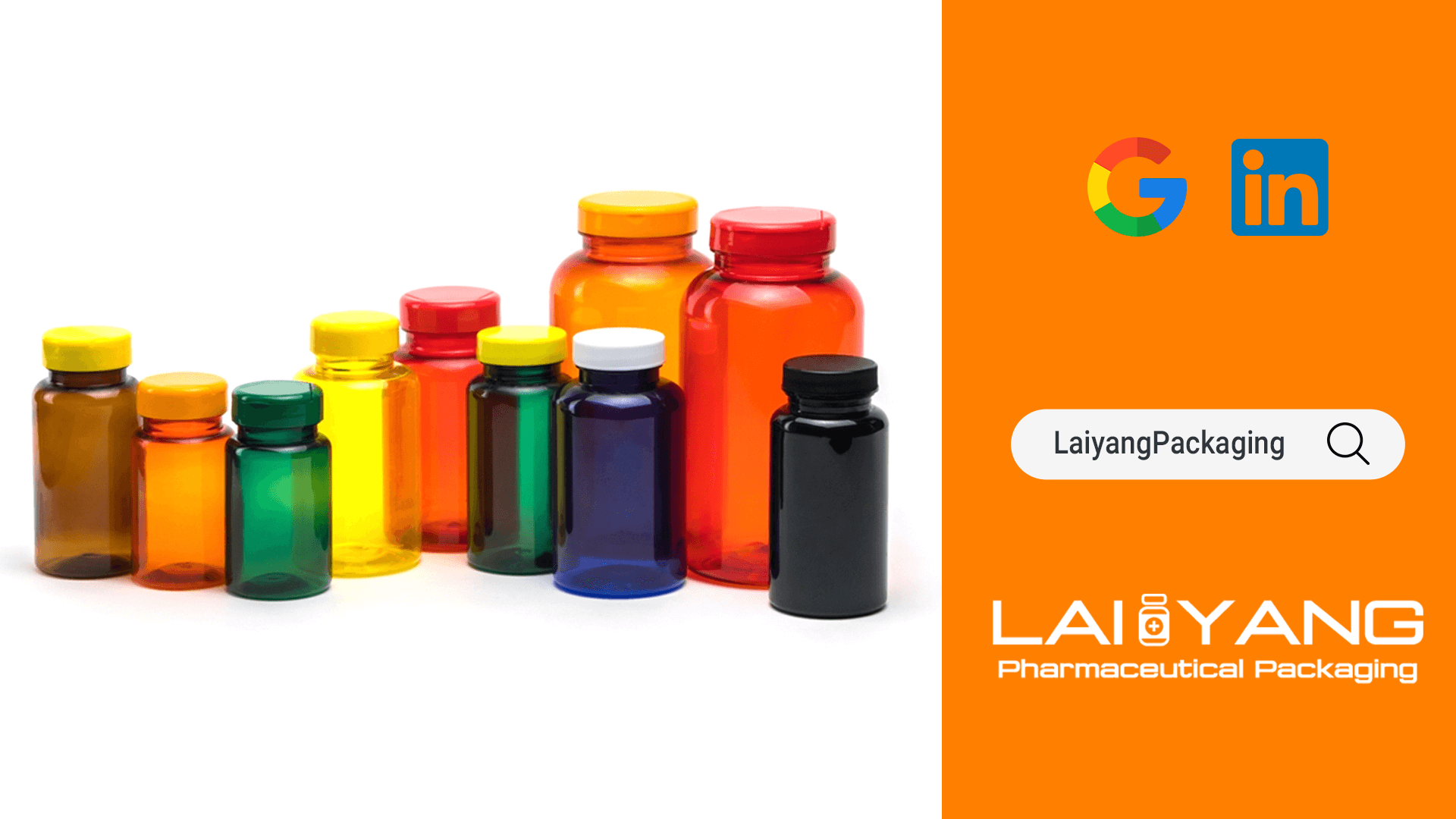
When you walk into a pharmacy or browse healthcare products online, have you ever been drawn to a particular product by its color? Do you feel that a certain color looks more ‘professional’ or ‘effective’? In reality, color in the pharmaceutical and healthcare industry serves a purpose beyond aesthetics. It is a critical factor in branding, user experience, and even regulatory compliance. This article explores how to make informed decisions when selecting the right colors for plastic bottles used in medical and healthcare applications.
Why is Color so Crucial?
Color not only influences a consumer’s initial impression of a product but also triggers a range of emotional and psychological responses. In the pharmaceutical and healthcare industry, these responses are even more significant as they are directly linked to people’s perceptions of product efficacy and safety.

Enhancing Brand Recognition
The right choice of colors can significantly enhance brand recognition. Consumers often associate specific colors with a particular brand or product functionality. For example, green is often associated with ‘natural’ or ‘organic,’ while blue may convey a sense of ‘purity’ or ‘science.’
Improving User Experience
Colors can also improve the user experience. Some colors, such as bright orange or yellow, can grab attention, while softer hues like light blue or gray may be more soothing and preferable, especially for products intended for long-term use.
Regulations and Standards
Choosing the wrong colors can potentially lead to regulatory issues, particularly if the colors mislead consumers about the product’s efficacy or ingredients. Therefore, compliance is a crucial factor to consider when selecting colors for plastic bottles in the pharmaceutical and healthcare product industry.
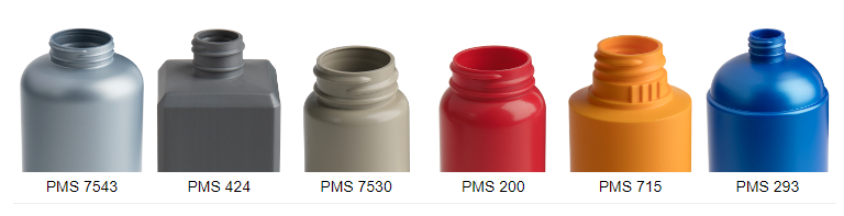
Revisiting the Original Colors of Plastics: A Focus on HDPE, PP, PET
The process of color selection doesn’t start from a blank canvas. In fact, different types of plastics come with their own “natural” colors, which will impact the final product’s appearance and performance. In this section, we will focus on the three most commonly used plastics in the medical and healthcare industry: High-Density Polyethylene (HDPE), Polypropylene (PP), and Polyethylene Terephthalate (PET).
High-Density Polyethylene (HDPE):
Original Color: Typically semi-transparent or milky white.
Color Versatility: Due to its light original color, HDPE can be easily colored, making it suitable for various color options. Given its good color adaptability, you can choose colors based on brand requirements and target markets. However, please keep in mind that different colors may have varying levels of UV blocking capability, which can affect product shelf life.

Polypropylene (PP):
Original Color: Generally white or semi-transparent.
Color Versatility: Since it is naturally white or semi-transparent, PP is also suitable for a range of color choices. If you require high-temperature resistance and chemical stability, PP is a good choice. When choosing colors, consider how the product will be stored and used, and whether light-blocking or other special treatments are needed.
Polyethylene Terephthalate (PET):
Original Color: Typically clear or with a slight blue-green tint.
Color Versatility: PET is relatively transparent, so color options are somewhat limited. As PET is often used in applications requiring high transparency, color selection should prioritize not compromising the visibility of the product’s contents. Some light or semi-transparent colors might be better choices.

How Color Impacts Consumer Psychology and User Experience: A Journey from Visual to Emotional
The choice of color for plastic bottles is not merely a visual feast; it is closely linked to consumer psychology and user experience. Color has the ability to trigger specific emotional responses and even alter our perception of a product’s effectiveness and safety.
Color and Emotional Responses
Colors can evoke various emotions and psychological responses. For instance, red is often associated with urgency and importance, potentially prompting people to take action. Meanwhile, blue often instills a sense of calm and is more likely to be associated with trustworthiness and professionalism.
Color and Visibility
Opting for bright colors can enhance a product’s visibility on store shelves, thus boosting sales. However, in the medical and healthcare product sector, overly bright colors may give off an unprofessional or unserious impression.
Guiding User Behavior
Certain colors, such as green and blue, may guide users to perceive a product as safer or more natural. This not only aids in sales but also improves the user experience.
Ensuring Color Visibility and Recognition for Special Demographics
When discussing color choices, we often consider the mass market and mainstream consumers. However, in the medical and healthcare industry, considering the specific needs of certain demographics is not only a wise business decision but also a social responsibility. In this section, we will explore how to select the color of plastic bottles specifically for two special groups: the elderly and children.
Elderly Individuals: Clarity and Utility
As individuals age, their vision tends to decline. High-contrast colors (such as black and white or blue and yellow) are usually easier for the elderly to distinguish.
Children: Balancing Fun and Safety
Children are often attracted to vibrant, colorful designs. However, this design choice needs to be made carefully to avoid giving children the impression that medical or healthcare products are toys. Using colors that children can easily recognize and remember may help them use the products correctly. For example, using red and green to distinguish “stop” and “go.”
Balancing Diverse Needs: How to Achieve It?
When considering specific demographics, we may need to make trade-offs and compromises. One possible solution is to use interchangeable or customizable bottle caps or labels so that different groups of people can personalize the product according to their needs.
How to Ensure That Color Choices Do Not Mislead Consumers or Violate Regulations
When choosing the color for plastic bottles, it’s essential to consider not only aesthetics and functionality but also ensure that it doesn’t mislead consumers and complies with various regulations. This might sound a bit challenging, but with a few simple steps and considerations, you can find a color scheme that is both compliant and appealing.
Understanding and researching regulations.
Before choosing a color, make sure you have a thorough understanding of all relevant regulations, both domestic and international.
Avoid colors that can be misleading.
- Do not use colors that can be misleading
- Exercise caution when using colors related to safety and efficacy.
User testing and feedback.
- Conduct consumer surveys or focus group discussions to understand how different demographics interpret the colors you have chosen.
- Conduct A/B testing in the market to test different color schemes and observe which color best meets regulatory requirements while still attracting consumers.
Review and update regularly.
- Regularly review regulatory changes to ensure your product remains compliant.
- Adjust based on consumer feedback and market demands to ensure your product not only complies with regulations but also meets consumer needs and expectations.
Considerations for functionality.
UV Barrier: Some colors are better at blocking UV rays, extending the product’s shelf life.
Impact of UV on Products
Degradation: UV radiation can cause certain chemicals to break down, reducing the effectiveness and safety of the product. Color Alteration: UV rays can also lead to changes in product color, affecting its appearance.
Choosing UV Barrier Colors
Darker colors are often more effective: Dark colors such as brown and blue are better at blocking UV rays and are commonly used for sensitive products. Limitations of transparent and light colors: Transparent or light-colored plastic bottles may not effectively block UV rays.
Special Colors and Materials
Adding UV stabilizers: Some plastic bottles incorporate UV stabilizers to enhance their UV-blocking capabilities.
Development of special colors: Some companies have even developed specialized colors specifically designed to block UV rays.
Environmental Impact
The Relationship Between Recyclable Plastics and Color
Colors Affecting Recycling Rates
Darker and Special Colors: Some colors can be challenging to recycle or may impact the recycling process.
Bright and Light Colors: Typically, these are easier to recycle and reuse.
Standardization and Coding Color Coding Systems: Adhering to industry standards to facilitate more efficient color sorting and recycling.
The Importance of Choosing Eco-Friendly Colors and Potential Challenges
Reducing Environmental Pollution: Choosing easily recyclable colors helps reduce waste.
Enhancing Brand Image: Demonstrating corporate environmental responsibility can enhance brand image.
Cost Considerations: Environmentally friendly colors and materials are typically more expensive.
Market Acceptance: The acceptability of environmentally friendly colors varies in different markets and cultures.
Compatibility and Performance: Ensure that the chosen environmentally friendly colors are compatible with other product characteristics, such as durability, UV resistance, etc.
Conclusion
This article delves deep into how to choose the right colors for plastic bottles in the medical and healthcare industry. We discuss the close relationships between color and brand image, material compatibility, user psychology, specific demographic needs, regulatory compliance, environmental impact, and more. Choosing the right color not only enhances market acceptance but also meets regulatory requirements, extends product shelf life, and reduces environmental impact. We provide recommendations for manufacturers and brands on how to make better color choices.
Recommendations for Manufacturers and Brands
Comprehensive Analysis from Multiple Angles
- When determining color choices, it’s essential to consider multiple perspectives. This includes brand image, consumer acceptance, material compatibility, environmental factors, and regulatory requirements.
Data-Driven Decision-Making
- Conduct market research and user surveys whenever possible to understand the preferences and needs of your target audience.
- Perform laboratory tests before finalizing color choices to ensure compatibility with materials and environmental friendliness.
Flexibility and Adaptation
- Stay informed about new technologies and market trends to be able to adjust your color strategy promptly.
- Considering the trend of globalization and the varying interpretations of colors in different cultural backgrounds, opt for colors with universal acceptance.
Long-Term Planning
- In addition to meeting current market demands and regulatory requirements, consider long-term environmental responsibility and sustainability.
Choosing the color for plastic bottles is a highly complex task involving multiple critical factors. It is our hope that this article provides manufacturers and brands with comprehensive and practical guidance to assist you in making informed choices within this intricate decision-making process.
If you have further questions or need more information, please feel free to contact us. Thank you for reading!